LightUp Design System: Designing with Empathy at Workspace to Boost Efficiency
At a B2C company, focusing on harnessing the power of design to free my coworkers from repetitive tasks and foster creativity.
Role
UX Designer
Timeline
Aug - Sep 2023
Location
Beijing, China
Responsibility
Initiated and developed a design system under the supervision of the UX lead to reduce the time of app updates.
01 - Prologue
Why I initiated the redesign
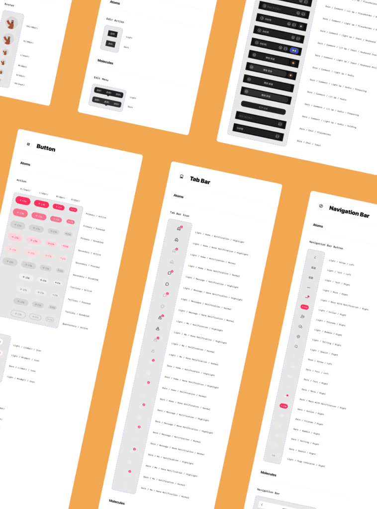
At LightUp, a social media company, the absence of a unified design system made updates cumbersome for the team. Developers struggled to decipher interface structures due to scattered design elements, while designers struggled to check every basic component and variable.
So, I set out to tidy things up, aiming to improve the communication between teams and increase their work efficiency.
02 - Design Principles
It’s like creating a building instruction booklet of a LEGO castle…
Based on stakeholder feedback, general design standards, and company branding, I established clear principles that ensured unity and consistency.

03 - Interface Structure
Determine higher structure based on existing use cases
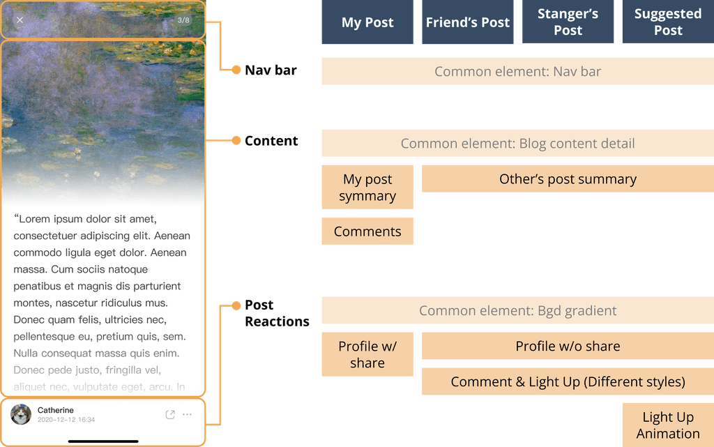
Picture the grandeur of a LEGO castle - its towers, walls, and chambers. Similarly, I mapped out the high-level structure of the blog-post page based on four existing main user cases and organized the interface into three main parts.
04 - Component Identification
Organize every LEGO piece
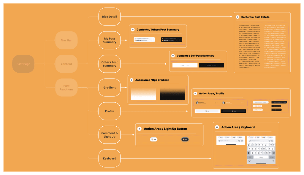
I created an information architecture, dividing larger interface parts into smaller components. Like assembling LEGO pieces, I ensured these elements were intuitive for both designers and developers.
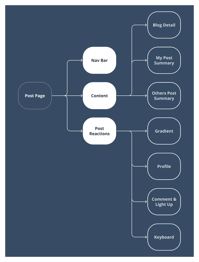
Building upon the prior macro understanding, this step delved into the micro aspects, making the design system efficient. It was the logical progression after establishing the higher structure.
04 - Putting it All Together
Make sure the booklet is functional and sustainable
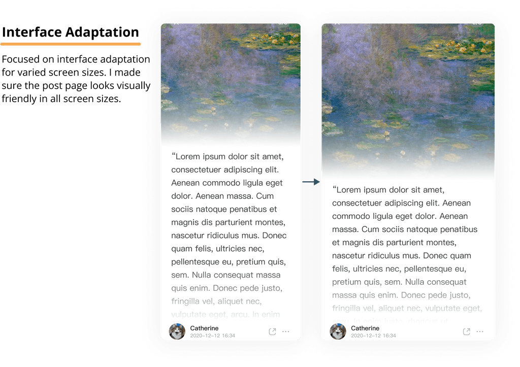
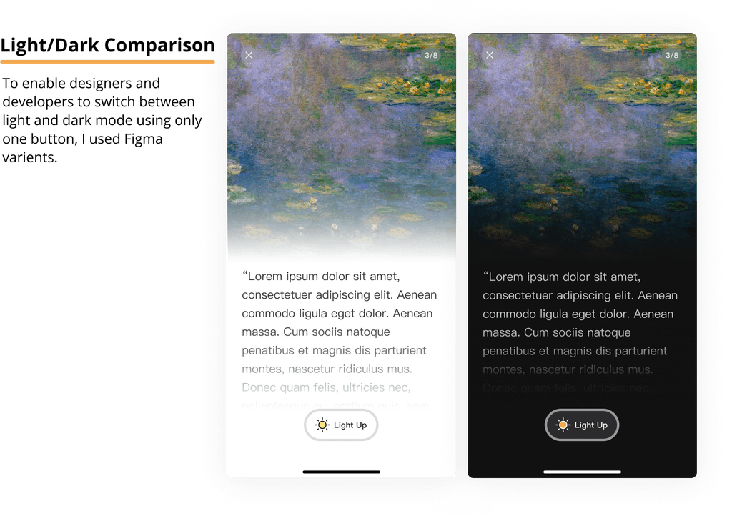
Following a similar design philosophy, this approach ensured that components seamlessly integrated into larger sections, reconstructing the original interface. To improve readability, I focused on three key areas:

05 - Project results and takeaways
Design for everyone
A comprehensive, organized design system was made for the post page, and this process was replicated across other interfaces. During the project, I developed strong logical & critical thinking skills, and showed empathy to my target audience - fellow developers and designers.
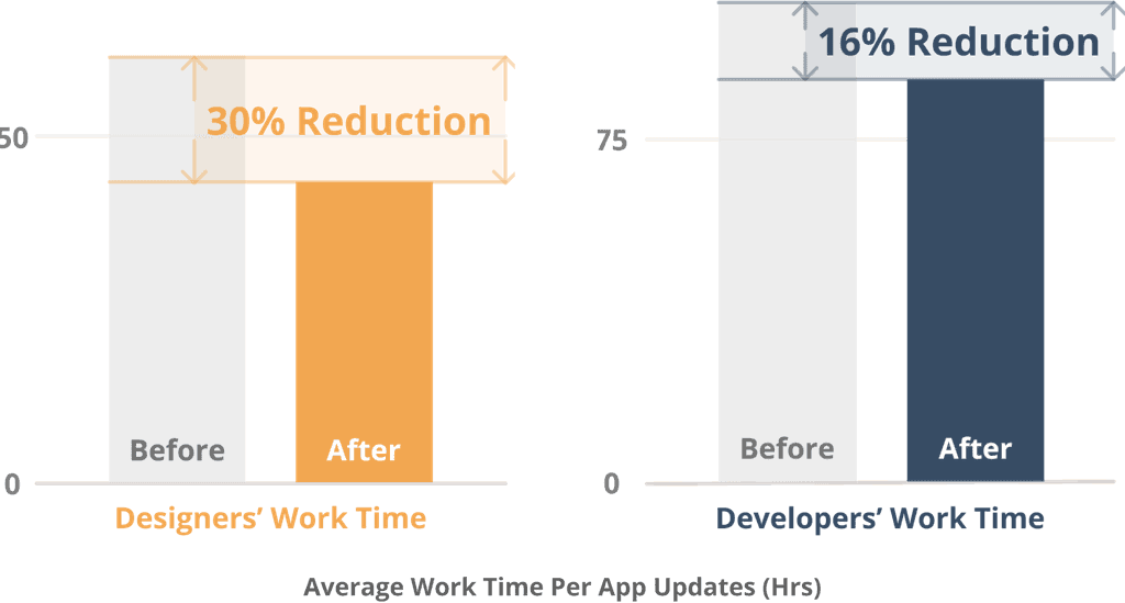
The new design system, validated by time tracker data, reduced designer and developer team work times during app updates.
